蘋果品質二元分類機器學習
引言
封面是用 Bing 繪製的「對一顆蘋果做高科技分析」,不明覺厲就是在描述這種感覺吧?
_(´ཀ`」 ∠)_ 原本是用蘋果資料集的,但基於種種麻煩的原因,現在改成用經典的 iris (鳶尾花) 資料集。本文章在於整合 R 語言的各種工具與模型。
資料描述
資料是經典的 iris (鳶尾花) 資料集,蒐集了 3 種鳶尾花,每種 50 筆資料。每筆資料包含:
Sepal.Length花萼長度。Sepal.Width花萼長度。Petal.Length花瓣長度。Petal.Width花瓣寬度。Species品種。
| Sepal.Length | Sepal.Width | Petal.Length | Petal.Width | Species |
|---|---|---|---|---|
| 7.0 | 3.2 | 4.7 | 1.4 | versicolor |
| 6.4 | 3.2 | 4.5 | 1.5 | versicolor |
| 6.9 | 3.1 | 4.9 | 1.5 | versicolor |
| 5.5 | 2.3 | 4.0 | 1.3 | versicolor |
為簡化問題,本文考慮 2 個品種 (versicolor 與 virginica) 的鳶尾花,目標是透過花萼與花瓣長寬來預測花的品種,即 4 個數值型特徵的 2 元分類問題。
套件
強烈建議使用這幾個通用套件
- dplyr 能使用
%>%簡單直觀的操作 data frame。 - ggplot2 經典視覺化套件。
- caret 訓練模型大彙總。
library(dplyr) # data frame operation
library(ggplot2) # plot tool
library(caret) # train model
資料讀取
選擇第 2 與 3 個品種的鳶尾花,第 2 種花的範圍是 51 至 100,第 3 種花的範圍是 101 至 150。
# read data
data = iris[51:150, ]
data$Species = factor(data$Species)
rownames(data) = 1:nrow(data)

print(data)
資料大致如下
      Sepal.Length      Sepal.Width Petal.Length      Petal.Width Species
48    6.2               2.9         4.3               1.3         versicolor
49    5.1               2.5         3.0               1.1         versicolor
50    5.7               2.8         4.1               1.3         versicolor
51    6.3               3.3         6.0               2.5         virginica
52    5.8               2.7         5.1               1.9         virginica
探索性資料分析 (Exploratory Data Analysis, EDA)
看看資料是否有空值 (NA, Not Available),與查看訓練目標 (Species) 是否是平衡的。
# NA check
cat("Any NA in Data?", any(is.na(data)), "\n")

# Blance check
summary(data$Species)
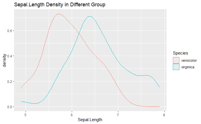
Density Plot
查看在不同族群中,數值是否有顯著差異。
ggplot(data) +
  geom_density(aes(x = Sepal.Length, colour = Species)) +
  labs(title = "Sepal.Length Density in Different Group")
在資料維度較高時,用以下方式可以自動的繪製所有特徵對應的密度圖。
y_colname = "Species"
x_colnames = setdiff(names(data), y_colname)

for(colname in x_colnames){
  plot =
    ggplot(data) +
    geom_density(aes(x = !!sym(colname), colour = !!sym(y_colname))) +
    labs(title = paste(colname, "Density in Different Group"))

  print(plot)
}


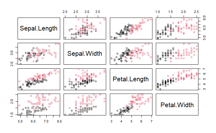
Pair Plot
成對點散圖能同時看到兩個變數在不同品種間的差異。
pairs(data[, x_colnames], col = data[, y_colname])
DataExplorer
DataExplorer 套件能做 NA 確定與視覺化等簡單的 EDA。
library(DataExplorer)
create_report(data,
              config = configure_report(plot_correlation_args = list(theme_config = list(axis.text.x = element_text(angle = 45)))))
              # Set the label of correlation plot to rotate 45 degrees
主成分分析 (Principal Component Analysis, PCA)
技術內容參見 主成分分析 (Principal Component Analysis, PCA)。其中的 prcomp 即為 PRincipal COMponent 的簡稱,center 與 scale. 是先將資料標準後再做 PCA。
pca = prcomp(data[x_colnames], center = TRUE, scale. = TRUE)

print(pca)
summary(pca)
其輸出如下,技術細節不贅述,見上文。
Standard deviations (1, .., p=4):
[1] 1.7198579 0.7450582 0.6369723 0.2850324

Rotation (n x k) = (4 x 4):
                    PC1        PC2         PC3        PC4
Sepal.Length -0.5071303 -0.2206112  0.69307315 -0.4623842
Sepal.Width  -0.4347497  0.8884477  0.05558682  0.1362480
Petal.Length -0.5436952 -0.3795872 -0.01943532  0.7482856
Petal.Width  -0.5081408 -0.1338093 -0.71845806 -0.4557478
Importance of components:
                          PC1    PC2    PC3     PC4
Standard deviation     1.7199 0.7451 0.6370 0.28503
Proportion of Variance 0.7395 0.1388 0.1014 0.02031
Cumulative Proportion  0.7395 0.8783 0.9797 1.00000
對解釋量做視覺化,簡單說的結論是「能用越少的 PC 達到越高的累積解釋量越好」。
pca.summary = summary(pca)

plot(pca.summary[['importance']]['Proportion of Variance', ],
     type = "b",
     xlab = "PC index",
     ylab = "Proportion of Variance",
     main = "Proportion of Variance",
     ylim = c(0, 1))

plot(pca.summary[['importance']]['Cumulative Proportion', ],
     type = "b",
     xlab = "PC index",
     ylab = "Cumulative Proportion",
     main = "Cumulative Proportion",
     ylim = c(0, 1))


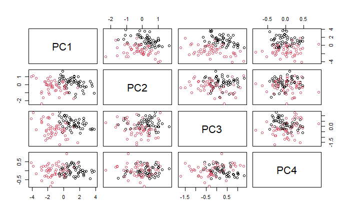
同樣的,能將資料投影到 PC 軸上進行視覺化。
pairs(pca$x, col = data$Species)
預處理
在各個 Species 中選取 70% 作為訓練集,剩餘 30% 做為測試集。
# sampling
set.seed(1234)
trainIndex = createDataPartition(data[, y_colname], p = 0.7, list = FALSE)
train = data[trainIndex, ]
test = data[-trainIndex, ]
建模
交叉驗證 (Cross Validation)
一般建議用 10 折交叉驗證,若要修改折數請修改 number。
set.seed(1234)
train_control = trainControl(method = "cv", number = 10)
模型範例
接著我會用 caret 套件進行建模,並列出幾個常用的模型。
Logistic Regression
技術細節參見 邏輯回歸羅吉斯迴歸分析 (Logistic Regression)。
library(glmnet)

set.seed(1234)
logistic =
  train(data = train,
        Species ~ .,
        trControl = train_control,
        method = "glm",
        family = binomial())

logistic
多類別分類可用
library(nnet)

set.seed(1234)
logistic =
  train(data = train,
        Species ~ .,
        trControl = train_control,
        method = "multinom")

logistic
Linear Discriminant Analysis (LDA)
技術細節參見 Fisher's Linear Discriminant (FDA, LDA, QDA)。
set.seed(1234)
lda =
  train(data = train,
        Species ~ .,
        trControl = train_control,
        method = "lda")

lda
Support Vector Machine (SVM)
技術細節參見 支持向量機 (Support Vector Machine, SVM)。
library(kernlab)

set.seed(1234)
svm =
  train(data = train,
        Species ~ .,
        trControl = train_control,
        method = "svmRadial", # svmLinear, svmPoly, svmRadial
        preProcess = c("center", "scale"))

svm
Classification And Regression Trees (CART)
技術細節參見 分類與回歸樹 (Classification and Regression Tree, CART)。
set.seed(1234)
rpart =
  train(data = train,
        Species ~ .,
        trControl = train_control,
        method = "rpart")

rpart
Random Forest
library(randomForest)

set.seed(1234)
rf =
  train(data = train,
        Species ~ .,
        trControl = train_control,
        method = "rf")

rf
模型解釋
各模型輸出格式會有些微差異,但主要的概念大同小異,以 Random Forest 的輸出結果作為範例。
70 samples
 4 predictor
 2 classes: 'versicolor', 'virginica'
- 樣本數:70 個
- 特徵數:4 種 (Sepal.Length、Sepal.Width、Petal.Length 與 Petal.Width)
- 目標變數類別:2 種 (versicolor 與 virginica)
Pre-processing: centered (4), scaled (4)
- 預處理方式:平移與伸縮,即標準化
Resampling: Cross-Validated (10 fold)
Summary of sample sizes: 62, 64, 63, 63, 63, 63, ...
- 重新採樣方法:10 折交叉驗證
- 每次訓練的樣本數略有不同
Resampling results across tuning parameters:

  C     Accuracy   Kappa
  0.25  0.9422619  0.8832319
  0.50  0.9440476  0.8862319
  1.00  0.9297619  0.8557971
- 超參數嘗試範圍:這邊會根據各個模型不同而有不同種類的輸出。
- Accuracy 與 Kappa:可以理解為越接近 1 越好 (雖然會有 overfitting 的問題就是了)。
Tuning parameter 'sigma' was held constant at a value of 0.6320367
Accuracy was used to select the optimal model using the largest value.
The final values used for the model were sigma = 0.6320367 and C = 0.5.
- 超參數調整結果:一樣會根據不同的模型而有不同輸出,這邊會告知根據哪些標準而進行最終模型選擇。
結果評估
混淆矩陣
用 predict 函數,第一個輸入模型 (以 logistic 為例),第二個輸入 test 資料集。其輸出為模型推論的類別。接著 confusionMatrix 函數用於生成混淆矩陣,第一個輸入模型預測,第二個輸入為真實答案。
predictions = predict(logistic, newdata = test)

conf_matrix = confusionMatrix(predictions, test$Species)

print(conf_matrix)
其結果為
Confusion Matrix and Statistics

            Reference
Prediction   versicolor virginica
  versicolor         15         2
  virginica           0        13

               Accuracy : 0.9333
                 95% CI : (0.7793, 0.9918)
    No Information Rate : 0.5
    P-Value [Acc > NIR] : 4.34e-07

                  Kappa : 0.8667

 Mcnemar's Test P-Value : 0.4795

            Sensitivity : 1.0000
            Specificity : 0.8667
         Pos Pred Value : 0.8824
         Neg Pred Value : 1.0000
             Prevalence : 0.5000
         Detection Rate : 0.5000
   Detection Prevalence : 0.5667
      Balanced Accuracy : 0.9333

       'Positive' Class : versicolor
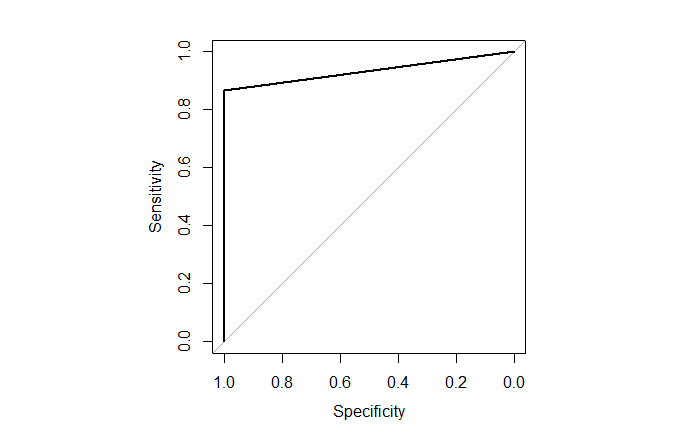
ROC 與 AUC
用 pROC 套件計算 ROC 與 AUC。此時的 predict 函數中加入了 type = "prob" 會使輸出為機率形式。roc 函數與 confusionMatrix 函數稍有不同,第一個輸入真實答案,第二個輸入預測。
library(pROC)

probabilities = predict(logistic, newdata = test, type = "prob") # predict probabilities

roc_curve = roc(test$Species, probabilities[, 2])

# plot ROC curve
par(pty = "s")  # "s" makes the plot shape a square
plot(roc_curve)
par(pty = "m")  # "m" makes the plot shape default

# show AUC
auc(roc_curve)
其輸出越接近 1 越好。
Area under the curve: 0.9333